
Limited-Time Offer: Enjoy 50% Savings! Ends in 00h 00m 00s Coupon code: 50OFF
Skip to content

Free Qlik Sense Business Analyst Certification Exam - 2024 QSBA2024 Exam Questions

Page: 1 / 9 Total 50 questions

Want more questions? Get Premium Access.

Question 1

A business analyst needs to create two side-by-side charts for a sales department with the following data:

* Number of orders

* Name of the customer

* Percentage of margin

* Total sales

The charts use a common dimension, but each chart has different measures. The analyst needs to create a color association between the two charts on the dimension values.

Which action should the business analyst take?

Correct Answer: C. Select 'By Dimension' and 'Persistent colors' in the Colors property panel
Explanation:

In Qlik Sense, the 'By Dimension' and 'Persistent colors' options in the Colors property panel ensure that the same dimension values have the same color across multiple charts. This is especially useful when you have two or more side-by-side charts sharing a common dimension, like customer names in this case. Persistent colors guarantee consistency in color assignment, helping users visually track the same dimension across different visualizations.

Key Concepts:

By Dimension: This option ensures that each unique value of a dimension (e.g., customer name) gets a distinct color across all charts that use this setting.

Persistent Colors: This feature ensures that the colors remain the same between charts, making the visual comparison across charts easier for the users.

Why the Other Options Are Less Suitable:

A . Use nested IF statements to set the colors by expression for each dimension value: While this would work, it would be unnecessarily complex to maintain and manage, especially with many dimension values.

B . Define the color values in the master measures and use the color library: This would only apply if the goal was to set colors based on measures, not dimensions. In this case, dimension consistency is required, not measure-based coloring.

D . Use the FieldIndex function to set the colors by expression for each dimension value: This would involve writing complex expressions that would not be as straightforward as using the built-in functionality of 'By Dimension' and 'Persistent colors'.

References for Qlik Sense Business Analyst:

Color Consistency Across Charts: The 'By Dimension' and 'Persistent colors' settings are recommended in Qlik Sense documentation when creating multi-chart layouts with shared dimensions, ensuring visual coherence across different charts.

The Persistent colors and By Dimension settings offer a straightforward and maintainable way to create color associations across charts, making option C the verified solution.
Question 2

A banking organization needs a dashboard that shows the following:

* A KPI indicator for current year (CY) versus last year (LY) revenue

* A scatter plot that shows the cost versus revenue of product categories

* A treemap that shows average customer satisfaction rating based on regions

* A table that shows CY cost by record number, financial instrument, and bank

In addition to the customer satisfaction rating, which fields should be used to create the required measures?

Correct Answer: A. CY Revenue, LY Revenue, CY Cost
Explanation:

The banking dashboard requires several KPIs and visualizations based on current year (CY) and last year (LY) revenue, as well as cost and customer satisfaction. To build the required measures, the fields CY Revenue, LY Revenue, and CY Cost are necessary because they provide the comparison between the current and previous year, as well as cost-related data for the specific calculations.

Key Concepts:

KPI for CY vs LY Revenue: This requires both CY Revenue and LY Revenue fields.

Scatter Plot for Cost vs Revenue: This comparison requires both CY Revenue and CY Cost to create the necessary relationship in the scatter plot.

Treemap for Customer Satisfaction: In addition to the customer satisfaction rating, the field CY Revenue would likely be used for additional insights by region.

Table with CY Cost: The table requires CY Cost data along with other relevant fields like record number, financial instrument, and bank.

Why the Other Options Are Less Suitable:

B . CY Revenue, LY Revenue, Cost: While this covers the revenue fields, it does not specifically include CY Cost, which is needed for the table and scatter plot.

C . Revenue and Cost: This option is too general and does not distinguish between current year and last year revenue, which is essential for the KPI.

D . Revenue and CY Cost: This does not include LY Revenue, which is required for the KPI.

References for Qlik Sense Business Analyst:

Comparison Measures in Qlik Sense: In Qlik Sense, comparisons across time periods like CY and LY require specific fields to calculate accurate insights, and it's essential to ensure the appropriate fields are included for each visualization.

Thus, A provides the correct set of fields for the required dashboard, making it the verified answer.


Question 3

A project management team uses an app to monitor different projects.

* Projects may have co-dependent tasks and processes

* Some projects include subtasks

The business analyst needs to use a diagram similar to a workflow with the processes and the sub tasks represented as boxes with lines to relate them to each other. The color of the boxes could also be determined by the status of each project or task.

Which visualization should be used?

Correct Answer: D. Network chart
Explanation:

A Network chart is the most suitable visualization for representing processes and tasks that have dependencies, such as projects with co-dependent tasks and subtasks. The network chart allows you to visualize relationships between nodes (in this case, tasks and subtasks) and can display them in a structured manner with lines connecting them based on their relationships. The colors of the boxes (or nodes) can be determined by the status of each project or task, which matches the requirements.

Key Concepts:

Network Chart: It's designed for showing interconnections or relationships between various elements. It is ideal when tasks or processes have dependencies or subtasks that need to be visually represented with links between them.

Color Representation: In a Network Chart, you can easily apply colors to nodes based on specific criteria, such as the status of the task, making it easier for users to track project progress at a glance.

Why the Other Options Are Less Suitable:

A . Sankey chart: While Sankey charts are used to show flow and relationships between categories, they are better suited for representing flows of data or values between stages, not hierarchical or task-related dependencies.

B . Grid chart: A grid chart is used to display values in a matrix but does not provide the relational and hierarchical representation needed for tasks and subtasks.

C . Org chart: Org charts are useful for showing hierarchies but are more structured for organization personnel or roles rather than co-dependent tasks and workflows.

References for Qlik Sense Business Analyst:

Network Diagram: Network charts are widely used for visualizing complex relationships between entities, which aligns with the need to visualize tasks and subtasks in project management.

Thus, a Network chart provides the best solution for visualizing tasks and subtasks with their dependencies, making D the correct answer.


Question 4

Refer to the exhibit.

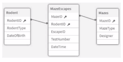
An app that will track experiments for rodents (e.g., rats and mice) that navigate mazes (labyrinths) is being developed. Individual rodents are catalogued in the Rodent table, while the Mazes table has metadata for the mazes. The MazeEscapes table holds a record of each attempt at a maze by a rodent. A business analyst needs to build a KPI that will allow users to see how many rodents have made at least one attempt at any maze.

How should the analyst construct the KPI?

Correct Answer: A. * Create RodentlD AS RodentID_Counter in the MazeEscapes table. * Use Count (Distinct RodentlD Counter) as the KPI expression.
Explanation:

In this case, we need to count how many unique rodents have made at least one attempt at any maze. Since the relationship between the Rodent table and the MazeEscapes table is a one-to-many relationship (each rodent may attempt several mazes), the best approach is to base the calculation on the MazeEscapes table, as it holds the actual records of rodent attempts.

By creating a new field RodentID_Counter in the MazeEscapes table, the analyst ensures that each rodent's attempt is captured. Using the Count (Distinct RodentID_Counter) as the KPI expression then accurately counts each unique rodent that has made at least one attempt, without counting multiple attempts by the same rodent.

Key Concepts:

Distinct Count: The distinct count ensures that rodents who have made multiple maze attempts are only counted once.

MazeEscapes Table: This table holds the records of each attempt, making it the correct source for this KPI.

Why the Other Options Are Less Suitable:

B . Sum (RodentID_Counter) in the Rodent table: This would incorrectly sum the number of rodents rather than counting unique attempts, leading to inaccurate results.

C . Sum (RodentID_Counter) in the MazeEscapes table: Summing the counter would not account for the distinct rodents, leading to incorrect counting.

D . RodentID_Counter in the Rodent table: This would not correctly reflect the rodents that have made an attempt, as not every rodent in the Rodent table may have attempted a maze.

References for Qlik Sense Business Analyst:

Distinct Count in KPI: It is best practice to use Count(Distinct ...) when working with KPIs that require unique counts, such as counting distinct rodents in this scenario.

Thus, A is the verified answer because it ensures that each rodent is counted once, based on their attempts in the MazeEscapes table.


Question 5

A business analyst is creating a new app with sales dat

a. The visualizations must meet several requirements:

A Bar chart that shows sales by product group is used in multiple sheets

* A KPI object that visualizes that the total amount of sales is used once

* A Treemap that shows margin by product group is used one time inside a Container

Which visualization should be added to the master items library?

Correct Answer: C. Bar chart
Explanation:

The Bar chart is used multiple times across various sheets, which makes it a good candidate to be added to the Master Items library. Master items are reusable components that can be added to multiple visualizations across different sheets without needing to recreate them. Since the bar chart will be reused multiple times, adding it to the Master Items ensures consistency and reusability.

Key Concepts:

Master Items: These are predefined dimensions, measures, or visualizations that can be reused across multiple sheets in an app, ensuring consistency and reducing development time.

Why the Other Options Are Less Suitable:

A . Container: The container is only used once in this scenario, so it doesn't need to be a master item.

B . KPI: The KPI is only used once, so it does not require master item status.

D . Treemap: The treemap is only used once in a container, so it doesn't need to be a master item.

References for Qlik Sense Business Analyst:

Master Items for Reusability: Qlik Sense recommends adding frequently used charts or dimensions to the master items for easy reuse and consistency.

Thus, the bar chart is the best choice for adding to the master items, making C the correct answer.


Question 6

A clothing manufacturer has operations throughout Europe and needs to manage access to the data.

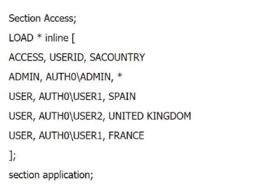
There is data for the following countries under the field SACOUNTRY -> France, Spain, United Kingdom and Germany. The application has been designed with Section Access to manage the data displayed.

What is the expected outcome of this Section Access table?

Correct Answer: A. USER1 sees data for France and Spain, USER2 sees data for the UK. ADMIN sees data for France, Spain, Germany and United Kingdom
Explanation:

In this Section Access script, the roles and access to data for different users are defined based on the SACOUNTRY field. Here's how the data access will work:

ADMIN: The ADMIN user has access to all data because the * in the SACOUNTRY field allows full access to all countries in the dataset.

USER1: This user has access to Spain and France because the SACOUNTRY field specifies these countries for USER1.

USER2: This user has access to United Kingdom because the SACOUNTRY field specifies only the UK for USER2.

Key Concepts:

Section Access: This feature in Qlik Sense controls which data users can see based on their login credentials. The access rights are controlled through fields like ACCESS, USERID, and SACOUNTRY in this case.

Why the Other Options Are Less Suitable:

B and C: These suggest that users won't see data they have access to, which contradicts the defined Section Access script.

D: This incorrectly assumes that ADMIN cannot see Germany, which is not defined in the script.

References for Qlik Sense Business Analyst:

Section Access Best Practices: In Qlik Sense, Section Access tables define the data that users can see, and the use of * for the ADMIN role ensures access to all data.

Thus, A is the correct answer because it matches the expected data access behavior based on the script, making it the verified answer.